
What can we expect from children’s fashion
It’s true that every brand has its own identity, and within that identity, trends are adapted to stay true to its audience, essence, and communication. But not every trend needs to be used literally.
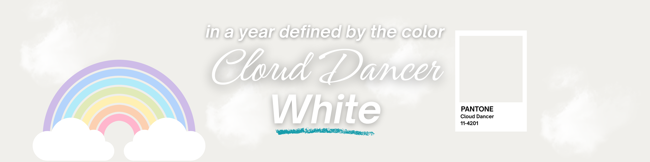
The shade of white chosen by Pantone for 2026 is a perfect example to expand this conversation, broaden our perspective, and analyze other angles:
The fact that Cloud Dancer 11-4201 acts as a symbol to evoke calm in a frenetic society, as Pantone itself describes, highlights how essential it is to observe human behavior—since it directly influences much of what we develop in fashion.
That doesn’t mean all brands must now include color 11-4201 in their children’s, women’s, men’s, or adult collections.
It’s much more about applying the meaning of Cloud Dancer than the color itself!
If we start from the idea that this color represents calm, clarity, and essentiality, these are the principles—and similar ones—that should be considered when developing collections and brand communication.
It’s possible to do this without “attacking” your brand’s identity, through prints, color palettes, materials, silhouettes, physical store layouts, and the organization of online sales channels.
Every element that makes up the “body” of your brand evokes feelings in your audience:
Brands that frequently rebrand, for example, may communicate insecurity—highlighting the importance of maintaining a consistent identity.
Collections developed with a clear focus on the same audience communicate coherence.
Keeping your audience informed about what’s happening within the brand—launches, movements, and collaborations—communicates order and clarity.

If you need help creating collections that apply trends while respecting your brand’s identity, or organizing the structure of your children’s fashion brand, count on me! Schedule a 30 min discovery call with me!